Content wasn't the problem. Finding it was.
66% headed to Explore, and most couldn't find what they came for. I traced three “separate” problems back to one root cause and proposed a phased, need-based redesign. The recommendations Headspace adopted lifted content discoverability 10%.
At a glance
Three “separate” problems, one root cause.
- Content discoverability after the audit
- +10%
- Research sessions behind 4 key findings
- 7
- Teams aligned on one member framework
- 3
- Role
- UX & Strategy
- Partners
- Product, research, content, design
- Timeline
- May to Sep 2023
- Methods
- UX audit, heuristic evaluation, stakeholder interviews, unmoderated testing (Dscout), analytics
Context
Explore got busier just as the library got harder to browse.
Headspace had just changed its bottom navigation from 4 tabs to 3, which sent a lot more traffic to Explore. 66% of people who left the homepage went to Explore looking for new content. At the same time, the library kept growing and wasn't set up for discovery.
I had full ownership of the initiative. I partnered closely with product, research, the content team and design counterparts, and drove the UX audit, heuristic evaluation, research study, analytics review, stakeholder interviews and the resulting design strategy end to end.
Problem
Three “separate” problems were really one.
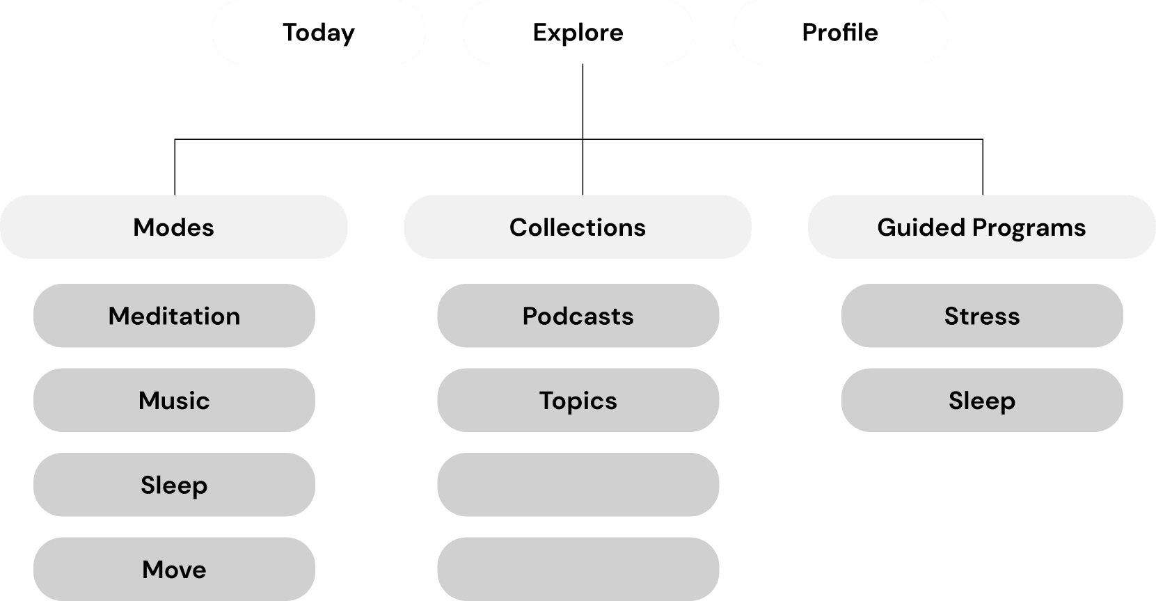
Members were frustrated, the formats felt inconsistent, and it was hard to know which piece of content was meant for you. The team saw these as separate problems, but as I dug in I realized they were really one.
“If members can't find what they need, they stop trusting the app understands them.”
Research
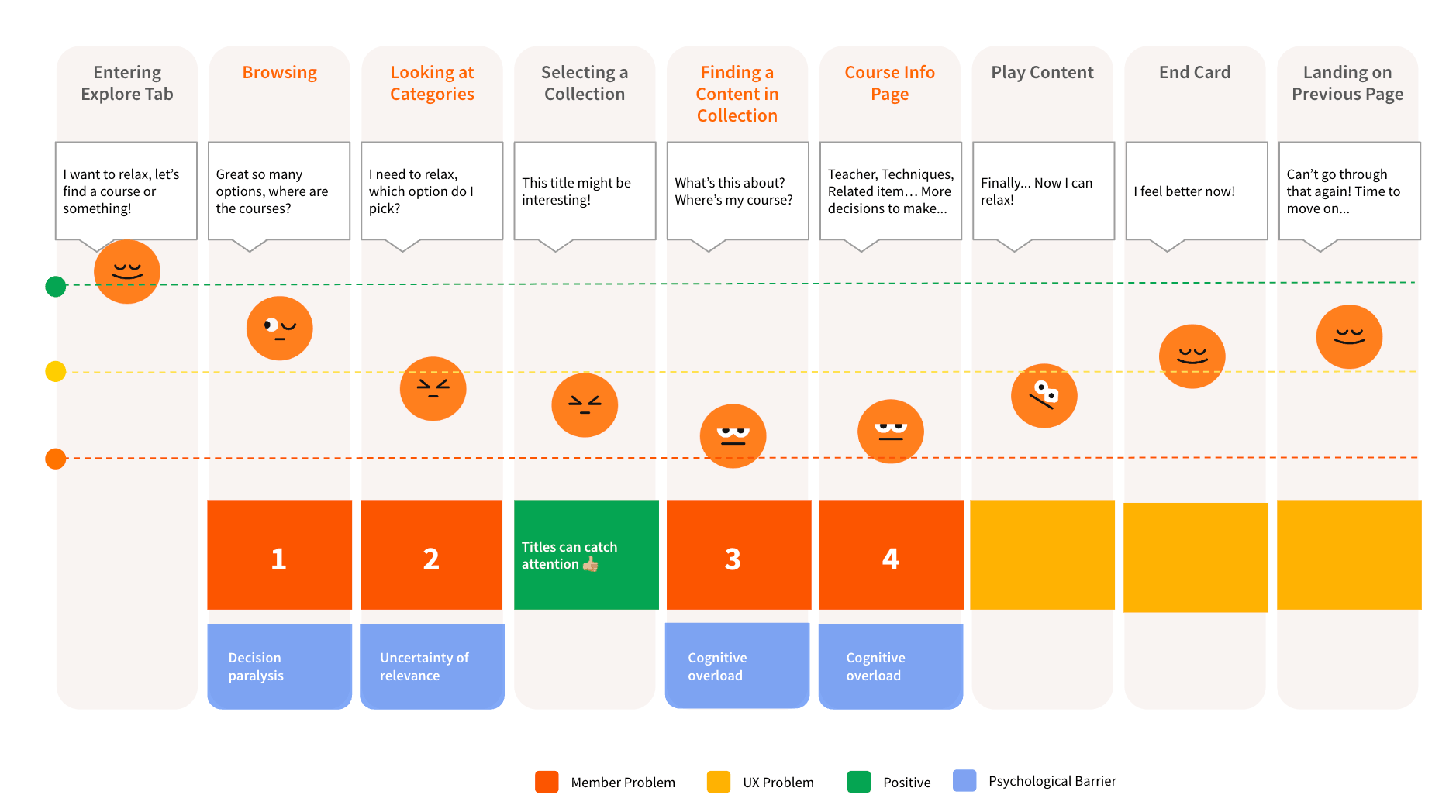
The audit surfaced four root issues.
- Members couldn't tell Courses, Guided Programs and Collections apart, causing decision paralysis
- They skimmed titles rather than reading descriptions
- Collections lacked a clear entry point or organizing logic
- Course pages buried key details below the fold
Insight
Content had to match how members approach care.
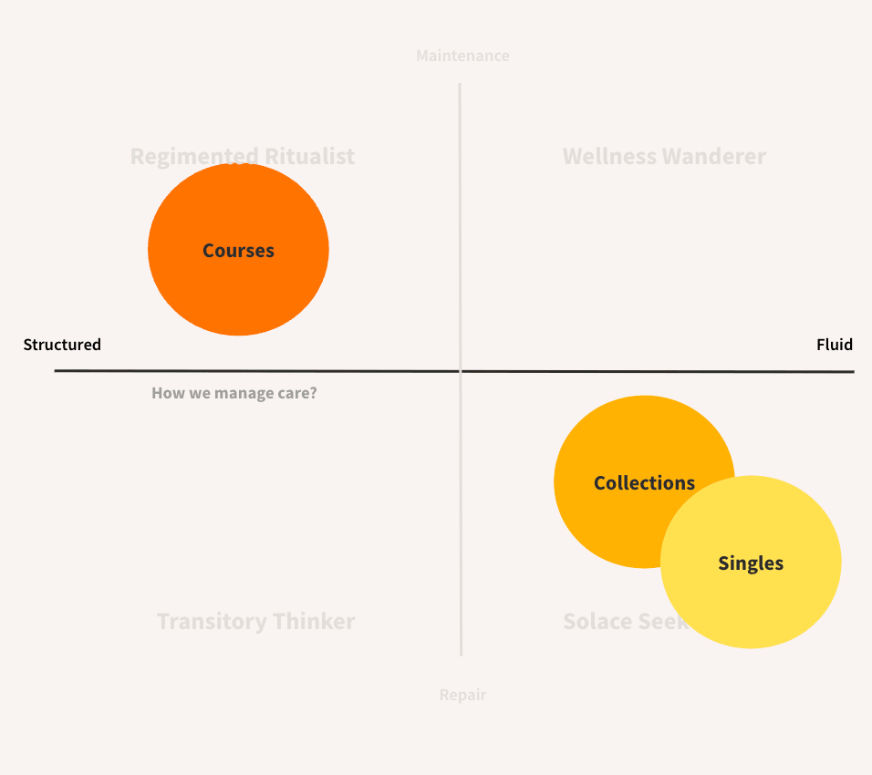
I took Headspace's new member framework (structured vs. fluid care, maintaining vs. repair) and used it to look at their three content categories, asking how well each matched the way members actually approach care.
Each category turned out to hold two different experiences: Courses split into Guided Programs and Meditation Courses, and Collections were either meant to be followed in order or browsed freely.
Solution
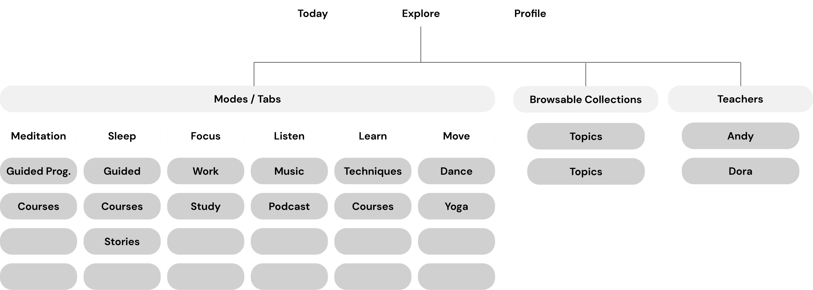
A need-based information architecture.
- Reclassify all progression-based experiences under a single “Course” model
- Shift titles from thematic to explicit and need-driven
- Redesign Collection pages with clear starting points
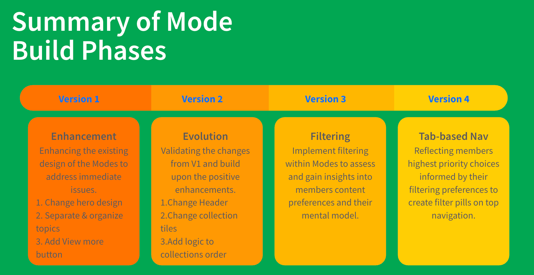
I structured the fix as a phased roadmap, so each change could be validated before the next was built.
The trade-off
Four phases instead of one big relaunch.
Instead of one big relaunch, I proposed four phases that could each be tested. It was slower, and it meant living with an imperfect Explore tab for longer.
But at Headspace, every change also went to compliance and clinical review. A phased approach let us use real data to decide if each step was worth it before moving on.
Impact
From a vague complaint to one shared framework.
The project reframed a vague “members can't find things” complaint into four evidence-backed problems, each paired with a concrete, testable solution and staged rollout. That gave leadership a low-risk way to sign off on incremental changes, and the recommendations Headspace adopted lifted content discoverability 10%.
What I'm most proud of is what happened behind the number. Product, content and taxonomy had each been trying to solve this on their own. The audit gave all three teams one shared framework to design from.
What I learned
Step back before you narrow in.
I discovered the power of workshopping and the benefits of taking a step back to explore alternative solutions. Considering different perspectives leads to more robust solutions.